TreemapVisualization contains a new report visualization that will display your reports as tiles of different sizes and will show you how each metric has changed from the last period.
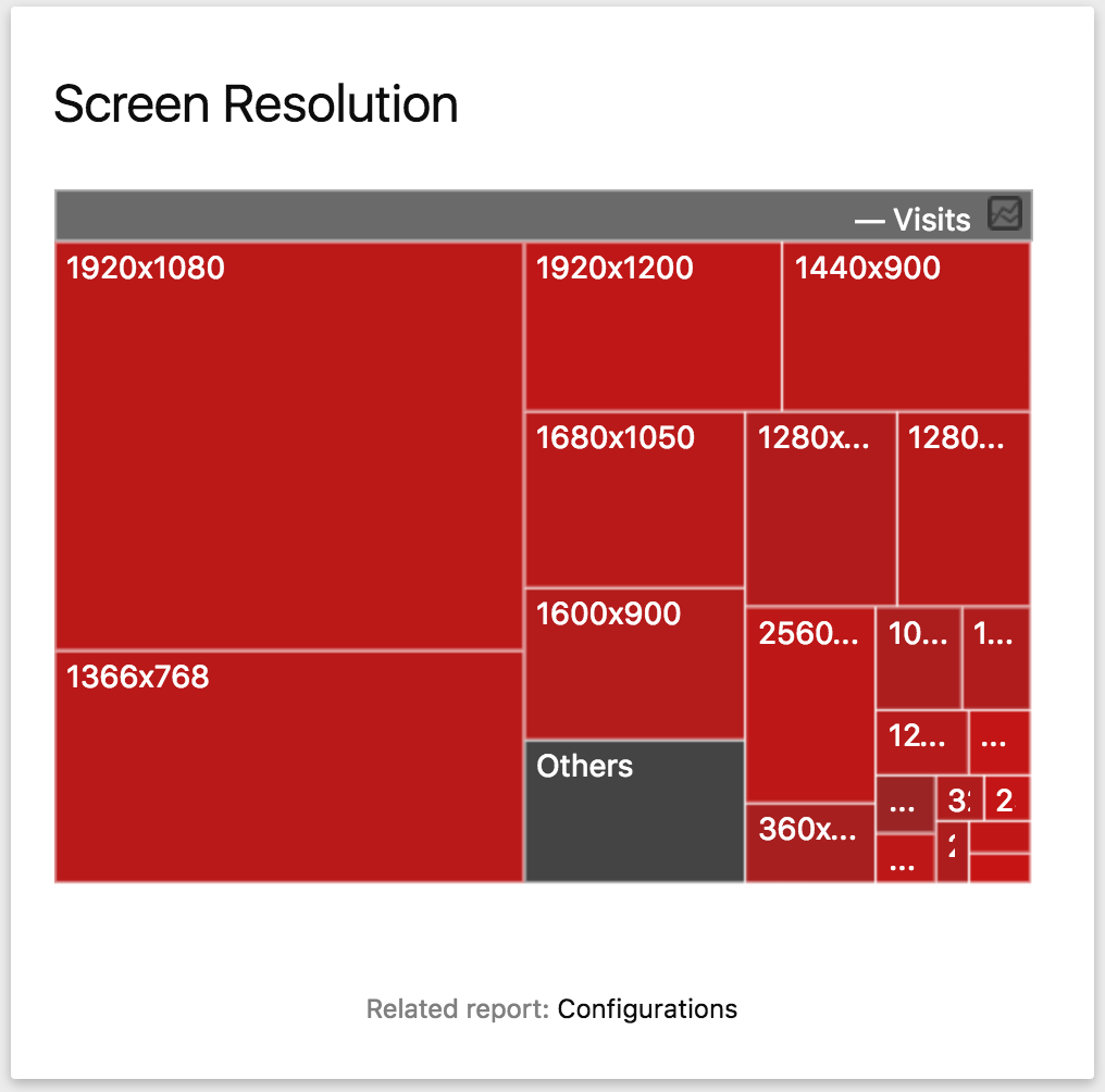
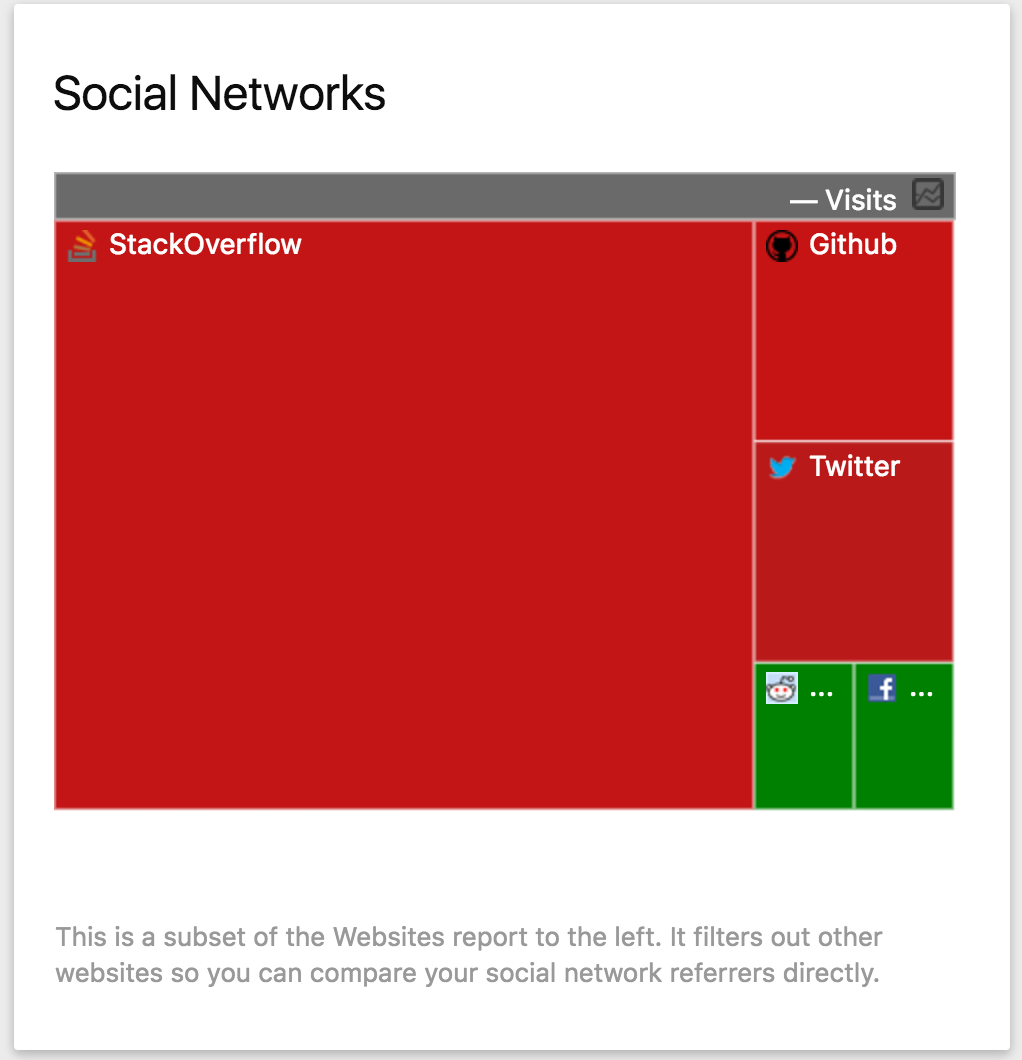
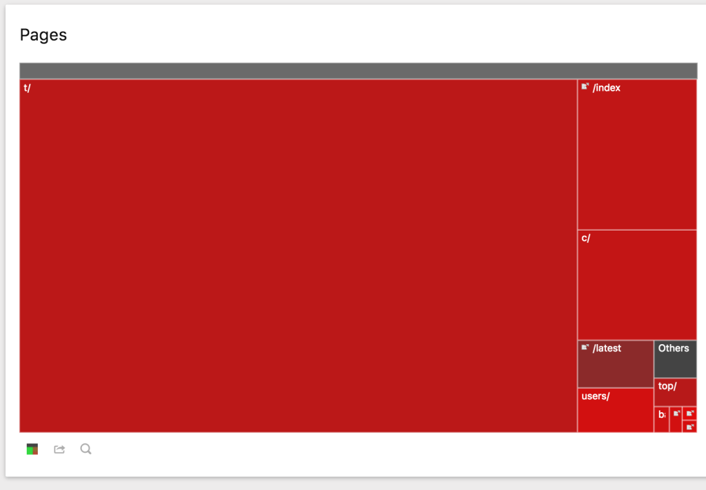
The treemap visualization displays rows of data as squares whose size corresponds to a metric in each row.
If you're looking at the visits in a report, the row with the most visits will take up the most space. Just like other graph visualizations, you can use it to easily see which rows have the largest values. The treemap differs from other graphs though, in that it can show many more rows.
Treemap colors for comparison with previous period
The treemap visualization will also show you one thing that no other visualization included with Matomo does: the evolution of each row. Hovering over a treemap square will show you how much the row changed from the last period (ie, the last day, week, etc.).
Each treemap square is colored based on the evolution value so you can easily see how your data is changing. A red square means the change is negative; a green square means the change is positive. The more green the bigger the change; the more red the smaller the change.
Known limitations
- Treemaps will not work with flattened tables. Currently, if a table is flattened, the treemap icon will be removed.
- Evolution values cannot be calculated for subtables (reports that are displayed when you click on a row or node).
Feedback, bug report or requests
github.com/matono-org/plugin-TreemapVisualization/issues
View and download this plugin for a specific Matomo version:
-
Screen Resolution Treemap
-
Social Network Treemap
-
Treemap
View and download this plugin for a specific Matomo version: